page title
KRDS provides UI/UX design standards based on web accessibility guidelines across elements such as styles, components, and patterns to help ensure that all users can access and use digital government services equally.
KRDS and Web Accessibility
KRDS aims to present UI/UX design standards that help users of all abilities, environments, and circumstances, including persons with disabilities, older adults, children, and foreign nationals, access services with equal effort. The system was designed with a focus on the accessibility needs of persons with disabilities and older adults, who face the greatest challenges in using digital services, and aims to develop into an inclusive environment for all users.
KRDS follows the Korean Web Content Accessibility Guidelines (KWCAG 2.2), the e-Government Website Quality Management Guidelines (Web Accessibility), and the international standard WCAG 2.1. To support compliance with these guidelines, KRDS provides key considerations for each component that can be applied during implementation to help ensure web accessibility in line with these standards.
However, not all accessibility guidelines can be defined solely from a component perspective, and as guidelines continue to be updated, using KRDS alone does not guarantee complete accessibility compliance. Therefore, it is essential to maintain continuous attention to web accessibility throughout service development and operations, and to actively reference the latest guidelines and related materials.
Referencing Web Accessibility in KRDS
Principles
Understand the second design principle, “Services that embrace all users,” including why this principle is vital and the primary methods for implementing it.
Style
Refer to web accessibility considerations within style elements such as color, typography, shape, layout, and iconography. Representative considerations include the following:
- Contrast between text, backgrounds, and graphical elements is required for precise information delivery
- Considerations for users with color vision deficiencies
- Use of highly readable typefaces
- Text size, weight, and line spacing
- Responsive grids and spacing between elements
- Logical structure and layout
- High-contrast display mode
Components and Patterns
Refer to the accessibility guidelines and interaction guidelines presented for each component and pattern.
-
Accessibility Guidelines
- Provide guidance based on web accessibility standards for common accessibility issues observed in each component.
-
Interaction Guidelines
- Specify the essential interactions that must be supported for accessibility and usability when implementing components, categorized by user interface type (e.g., keyboard and mouse).
Elements Designed for Digitally Vulnerable Users
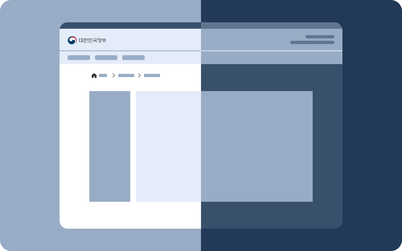
High-Contrast Mode
High-contrast mode, similar to dark mode, is a screen style that enhances readability and visibility for users with visual impairments or those in low-light environments. It uses a palette with dark backgrounds and bright foreground colors, providing additional visual cues for important information to ensure a clear and comfortable reading experience.
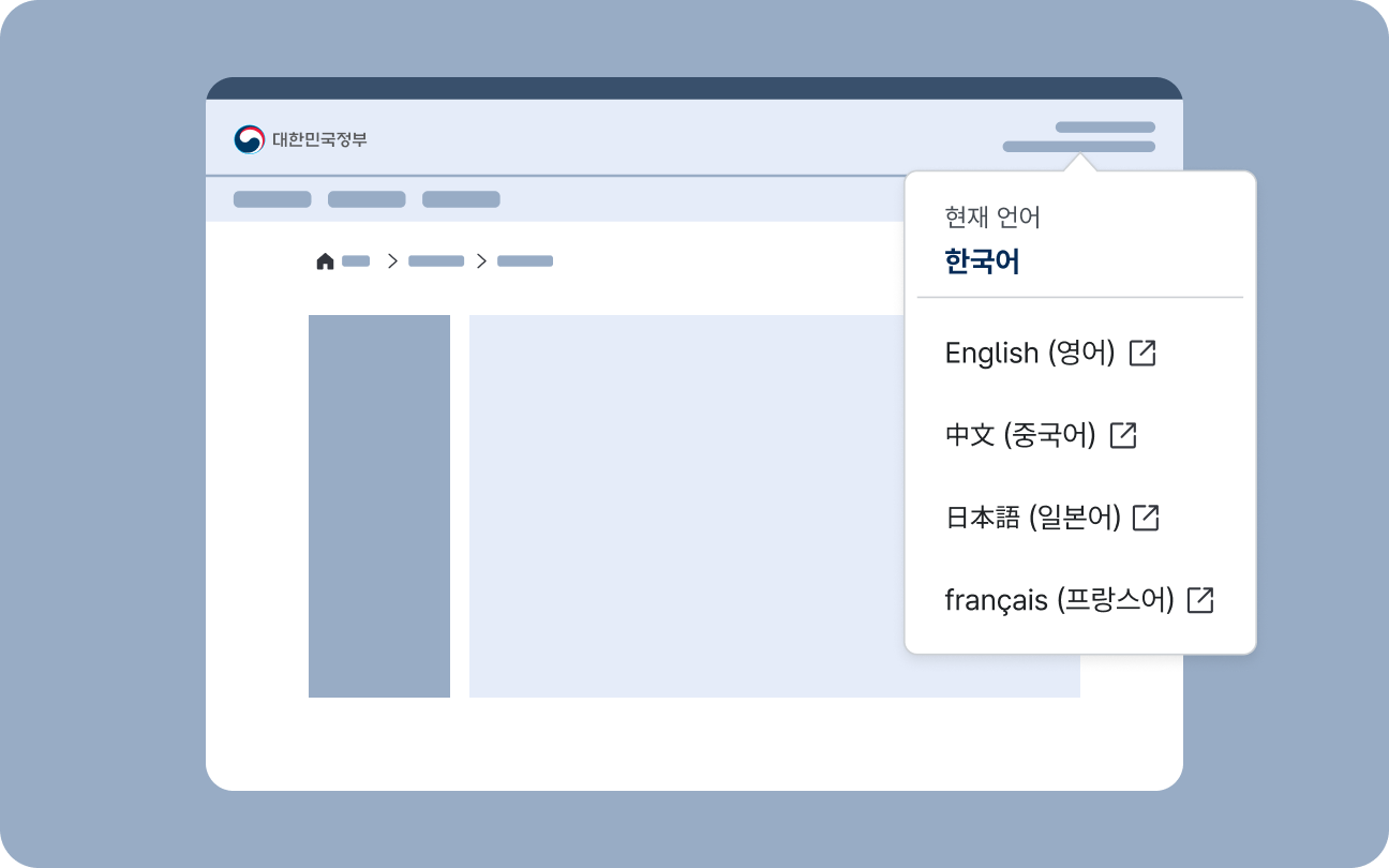
Language Switcher
A language switcher is used to change the language in which service content is displayed or to navigate to a separate foreign-language service. If users unfamiliar with Korean cannot locate the option to change the display language, they may be unable to use the service; therefore, providing an intuitive and consistent language-switching method is crucial for digital government services.
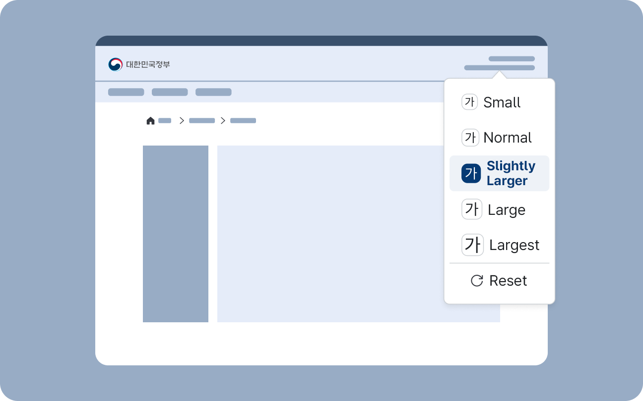
Zoom Controls
Zoom controls allow users to enlarge or reduce information displayed on the screen, including text. Text readability and the operable size of UI elements vary by user. Users can adjust the display of content to their preferred viewing style by using various settings supported by their device or user agent. However, users who rely on Zoom functionality may have difficulty finding and configuring these settings, so it is crucial for digital services to provide built-in Zoom controls that are easy to access.
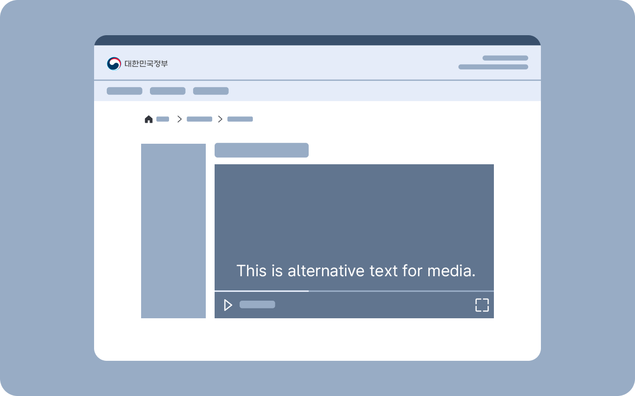
Accessible Media
This component is used when media content requires additional descriptions. Hidden content provides descriptions for still images, while accessible media components offer descriptions to audio, video, or multimedia content.
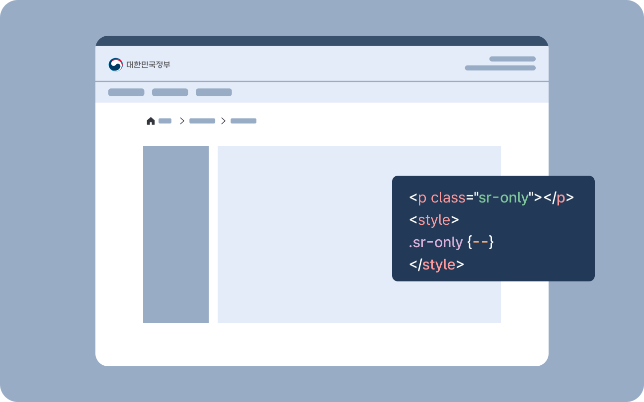
Hidden Content
Hidden content is a component used when descriptions are needed for screen reader users while remaining hidden from other users.
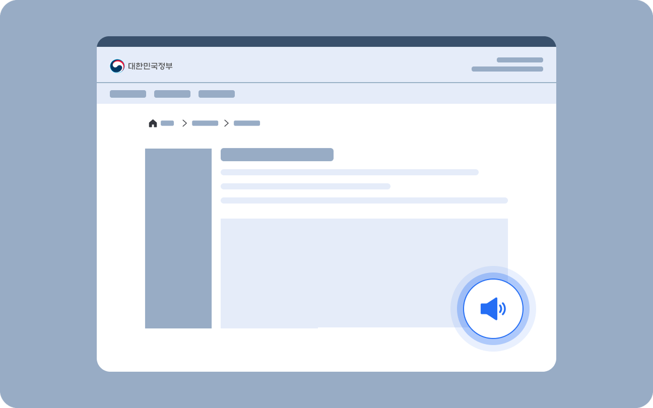
Voice Assistance
Voice Assistance provides optional audio playback of essential on-screen information, including guidance messages, form instructions, and process status updates.