page title
KRDS is a design system developed to ensure the convenience, consistency, accessibility, and usability of Korea’s digital government services. It provides a consistent user experience (UX) and user interface (UI) across public service websites and mobile apps, aiming to standardize diverse digital government services.
Need for KRDS
KRDS enables effective task execution by codifying design elements into design tokens. This minimizes communication issues and streamlines workflows between practitioners, such as designers and developers.
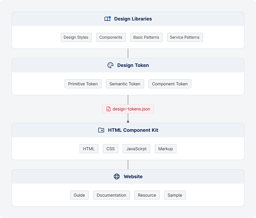
Integrating the Design Library, Design Tokens, and HTML Component Kits within KRDS is a key process in efficiently managing design and maintaining consistency in the development and operation of public websites and apps.
-
1Design Process Efficiency
KRDS systematizes design resources and components to enhance work efficiency and improve the reusability of design elements.
-
2Consistent Design Standards
KRDS centralizes the management of design attributes—such as color, typography, and spacing—by codifying them, ensuring consistent design across services.
-
3Improved Collaboration Among Practitioners
KRDS defines design token naming conventions in code, enabling designers and developers to communicate more effectively using a shared language.
Components
The KRDS design system is tailored for public digital government projects. It is a collection of rules, principles, components, style guides, patterns, and tools defined to provide a consistent user experience (UX) and to support efficient design and development processes.
Roles
Design Library
The Design Library is a space where common UI/UX design components are defined and managed. It helps maintain consistency and reusability of UI elements, allowing designers and developers to share a common understanding and apply unified standards. All visual elements—such as buttons, color palettes, and typography—are systematically organized within the library.
- Design Style : Rules for visually consistent expression of components and basic patterns (e.g., color, typography, shape).
- Component : The smallest unit of a user interface, representing common elements used consistently regardless of task (e.g., identity, navigation, selection).
- Basic Pattern : A group of user interface components that are repeatedly combined to perform key tasks (e.g., input forms, help, consent).
- Service Pattern : Standard prototypes based on user journeys for key tasks in digital government services (e.g., visit, login, application).
Design Tokens
A design token is a coded variable used to efficiently manage recurring design properties within a design system. Design tokens define style properties such as color, typography, spacing, and shadow, and convert them into code to help maintain consistent styling across the entire system.
KRDS Design Token is a style guide designed with consideration for digitally vulnerable users. Organizations that adopt the standard style guide can apply the tokens immediately, while organizations using the extended style guide may test and apply colors and shapes appropriate to their specific needs. It is designed to support compliance with accessibility standards.
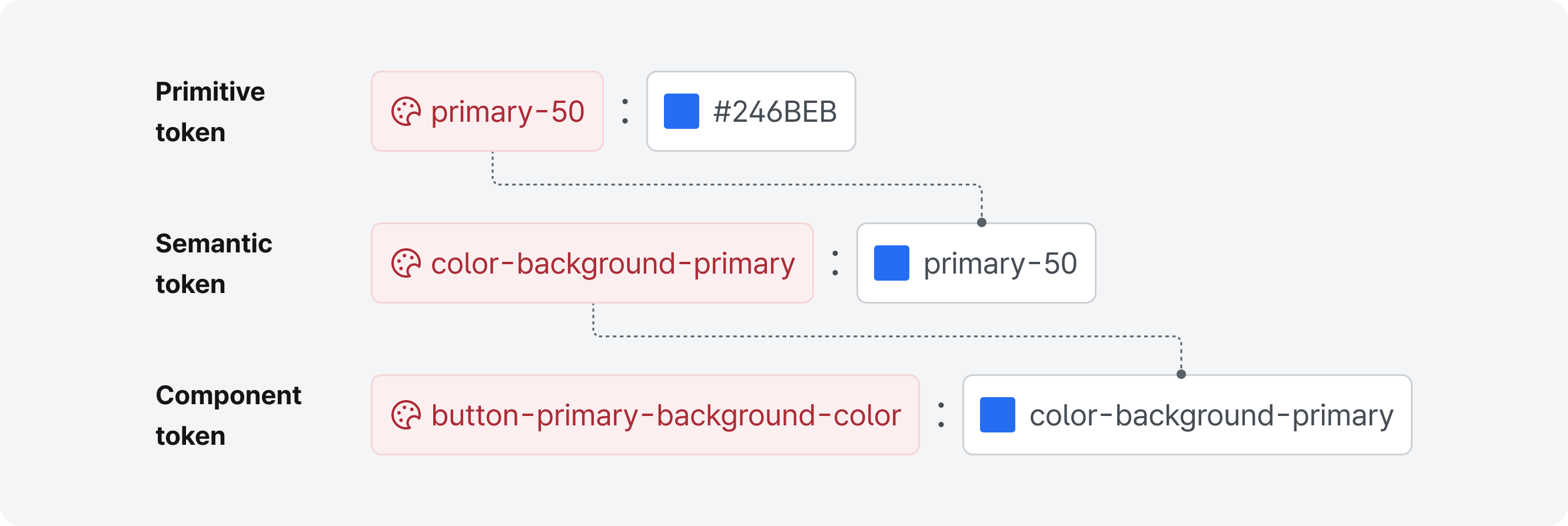
- Primitive Tokens : Represent the foundational level of design tokens, defining basic design properties such as color, typography, spacing, and radius.
- Semantic Tokens : Reference primitive tokens and represent properties with contextual meaning, commonly used to indicate particular states or roles.
- Component Tokens : Reference semantic tokens and define specific visual properties applied directly to particular UI components, such as buttons, input fields, and cards.
HTML Component Kit
The HTML Component Kit is a collection of web UI components built with HTML, CSS, and JavaScript, enabling developers to implement and reuse UI components defined by designers easily. The Kit provides guidelines to help developers install the HTML Component Kit and apply the design system with ease.
Using the HTML Component Kit enables developers to increase efficiency by reusing components rather than creating basic UI elements from scratch, while maintaining consistent design across services.
Key Features
- Reusability : Components such as buttons, forms, modals, and navigation bars can be easily implemented as reusable code.
- Design Consistency : Components follow a unified style to ensure a consistent user experience.
- Responsive Support : Many component kits are designed to support mobile and various screen sizes.
- Extensibility : Components can be customized to meet the design and functional requirements of each project.
Composition
- HTML Templates : Define the structural markup of components (e.g., buttons, text input fields, pagination).
- CSS Styles : Define visual design and layout properties (e.g., color, typography, shape).
- JavaScript (JS) : Adds dynamic functionality to enable interaction (e.g., main menus, modals, in-content navigation).
Website (Documentation Site)
The KRDS website serves as the central hub for advancing the philosophy of UI/UX in digital government services. It provides guidance and examples of the design system through documentation of usage instructions, objectives, rules, code samples, and other related information, allowing users—including designers, developers, and government officials—to easily reference the system. The website also serves as a communication channel that supports the integration of the above elements with project teams, thereby maximizing consistency and efficiency.
The Design Library on the website offers visual guidelines and design assets. These resources are translated into code through design tokens, and the HTML Component Kit further supports the development of functional UI components.