page title
KRDS provides reusable resources that help designers build consistent and thoughtful user experiences. It also offers guidelines for using these resources and includes tutorials that support KRDS 1.0 adoption. This helps reduce the time required to design new services.
Tutorials
This tutorial video shows users how to download the library, understand the file structure, use design assets, and work with design tokens.
Library
KRDS provides Figma libraries and supplementary resources needed to create user interfaces centered on user experience, service journeys, and interaction, all aligned with the design principles.
The Figma library is organized into style guides, components, basic patterns, and service patterns, all connected through design tokens. Supplementary resources do not include components, basic patterns, or service patterns; it is recommended to use Figma to access the complete library.
Typefaces and all design resources can be downloaded from the Resources page.
Figma
The Figma library provides components, basic patterns, service patterns, and style guides built with design tokens. These are organized into dedicated pages within the library.
- Style Guide Page: Guidance on color, typography, shape, layout, icons, and elevation
- Components Page: All variations of 43 components (types, sizes, interaction states, and mobile-specific variants)
- Patterns Page: 11 basic patterns and five service patterns composed of components
-
FigmaFigma Library v1.0.0 Figma Library Link
Supplementary Resources
Files in Sketch and Adobe XD formats that provide design style elements such as color and typography.
Design Resources Download (Sketch/XD)Getting Started with the Library (Figma)
KRDS design assets include styles, variables, components, and patterns, enabling designers to begin work even without an existing design system.
Before Using the Library
1Download the Font
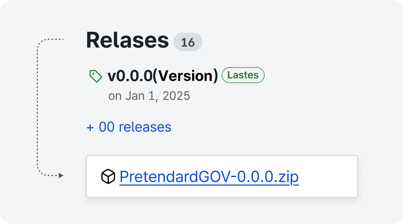
KRDS design assets require the Pretendard GOV typeface. Download the latest PretendardGOV.zip file from the Pretendard GitHub page.
2Download the File
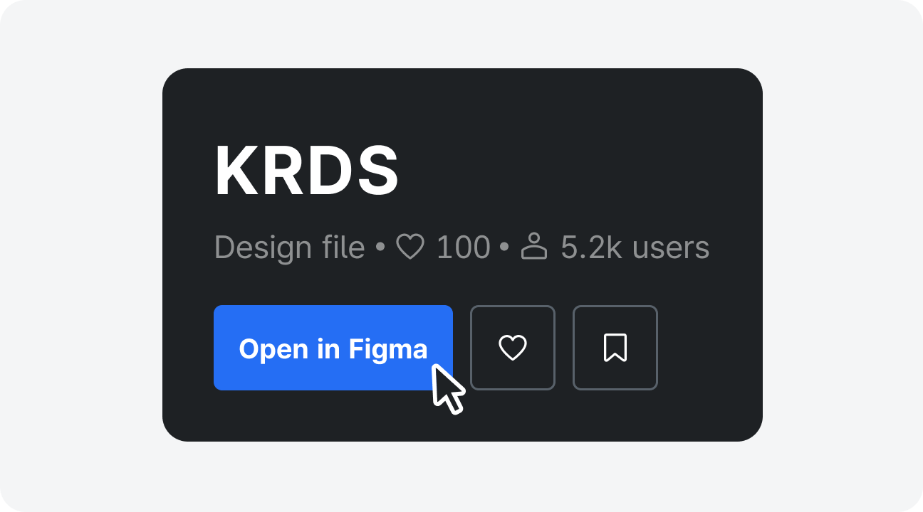
Visit the KRDS Community and open the corresponding Figma file (“file name”) ( Go to the KRDS Community and click the “Open in Figma” button).
Understanding the File Structure
Review the page structure in the left sidebar. The KRDS file consists of a style guide, components, patterns (basic and service patterns), and icons. In the right sidebar, users can check reusable tokens and styles. Selecting local variables opens a modal showing the token structure, and the regional styles area lists text, color, and effect styles.
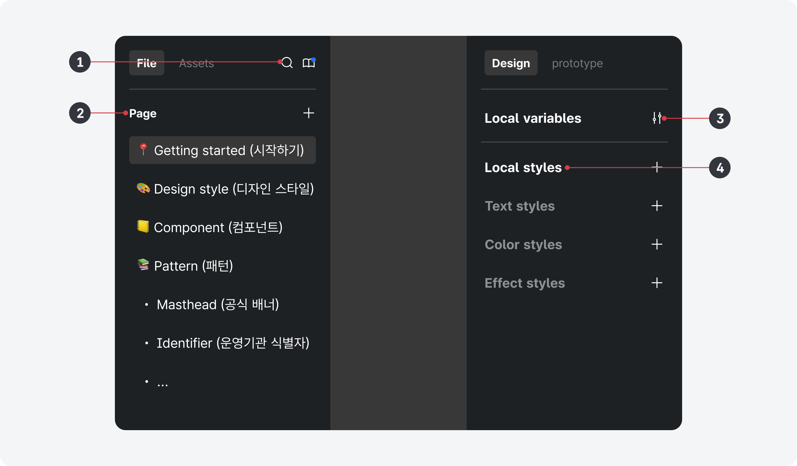
- 1.Exploring Assets: Search for components
- 2.Page Structure: Style guide, components, patterns, icons
- 3.Local Variables: View the token structure
- 4.Local Styles: Text styles, color styles (including gradients), and effect styles (including shadows)
Using Design Assets
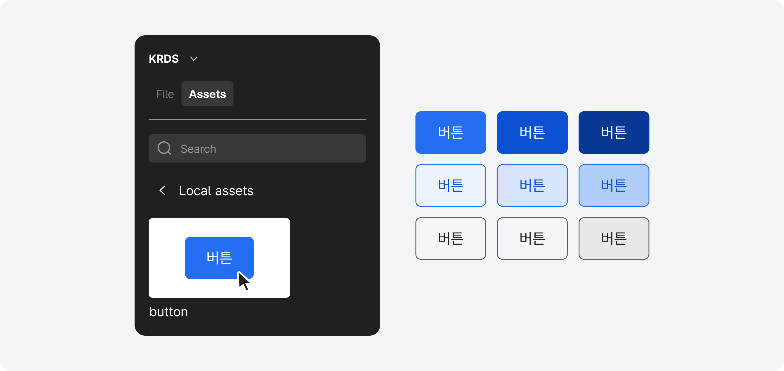
Exploring
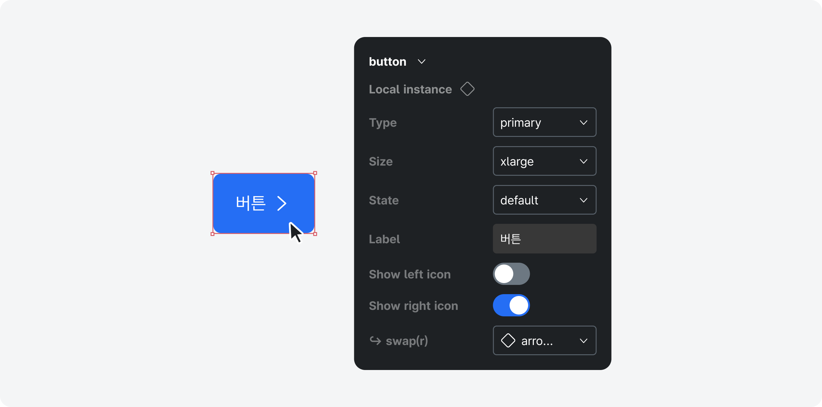
In the Assets tab in the left sidebar of “file name,” search for the components you need and place them onto the canvas. Only representative components appear in this panel. For example, only the “xl” button appears in the Assets panel, while all variants are available on their dedicated pages.
Customizing Variants
After placing a design asset onto the canvas, variants can be adjusted in the right sidebar. These include variations such as type, size, and interaction-based states.
Publishing and Adding the Library
Publishing the File
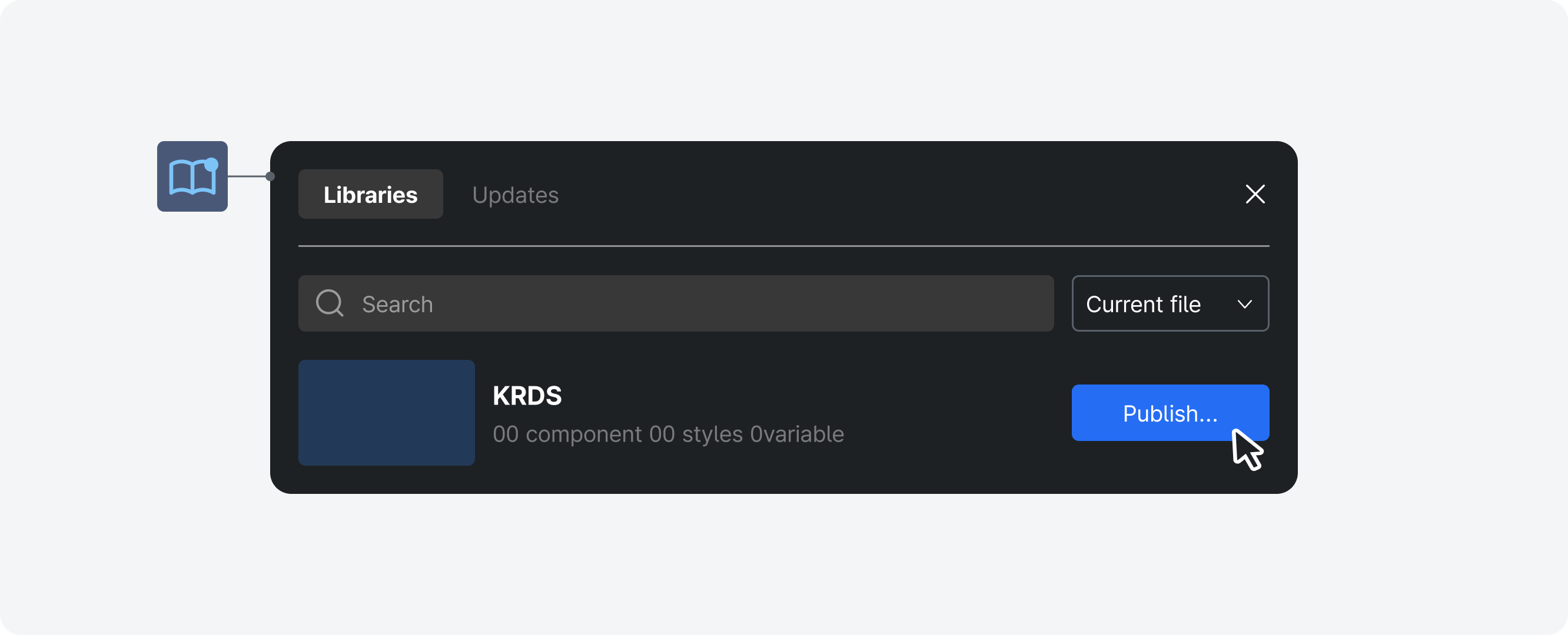
To use the downloaded “file name” design assets in other files, publish the downloaded file as a library.
(* Select the Assets tab in the left sidebar > Select the Library icon > Click the “Publish” button in the library modal)
Adding the Library
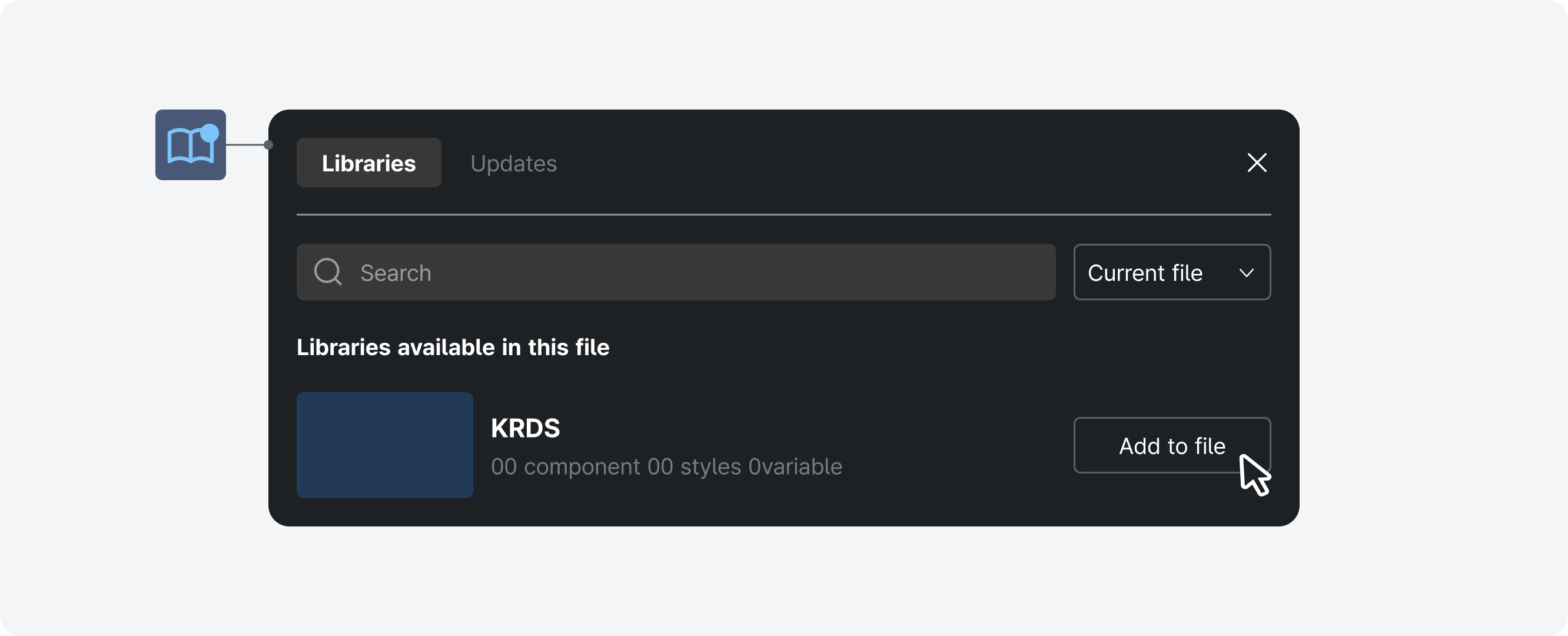
After publishing, locate the “file name” library in the Assets panel of the left sidebar and add it to individual files.
(* Select the Assets tab in the left sidebar > Select the Library icon > In the available library list, find the “file name” file and click the “Add to file” button)
Using Tokens
Design tokens are code-defined variables that represent abstract values and are used to efficiently manage design properties that recur throughout a design system. They define style attributes such as color, text, spacing, and shadows, and help maintain consistent styling across the system by enabling these attributes to be converted into code.
Using tokens in KRDS enables theme switching, like high-contrast and responsive themes, and helps maintain a consistent design across projects while making it easier to update the design system efficiently.
Variable Structure
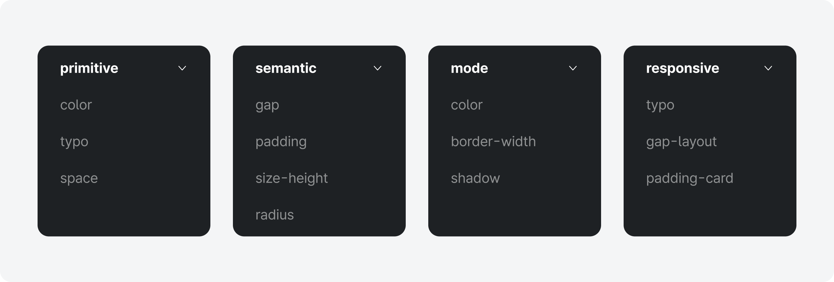
KRDS variables consist of primitive, semantic, mode, and responsive collections.
Primitive tokens store raw values that are not applied directly to UI elements but are referenced by other collections as foundational values. Semantic, mode, and responsive tokens assign meaning to primitive values, forming the variable sets used in actual UI elements.
With this structure, modifying a primitive token automatically updates all related styles, helping maintain consistency across the system and simplifying maintenance.
Theme Switching (High-Contrast Mode, Responsive)
KRDS uses Figma’s variable functionality to provide components that support theme switching. These are defined within the variable collections. To switch themes, place a component on the canvas, then select the desired theme (high-contrast or responsive) from the Appearance panel.

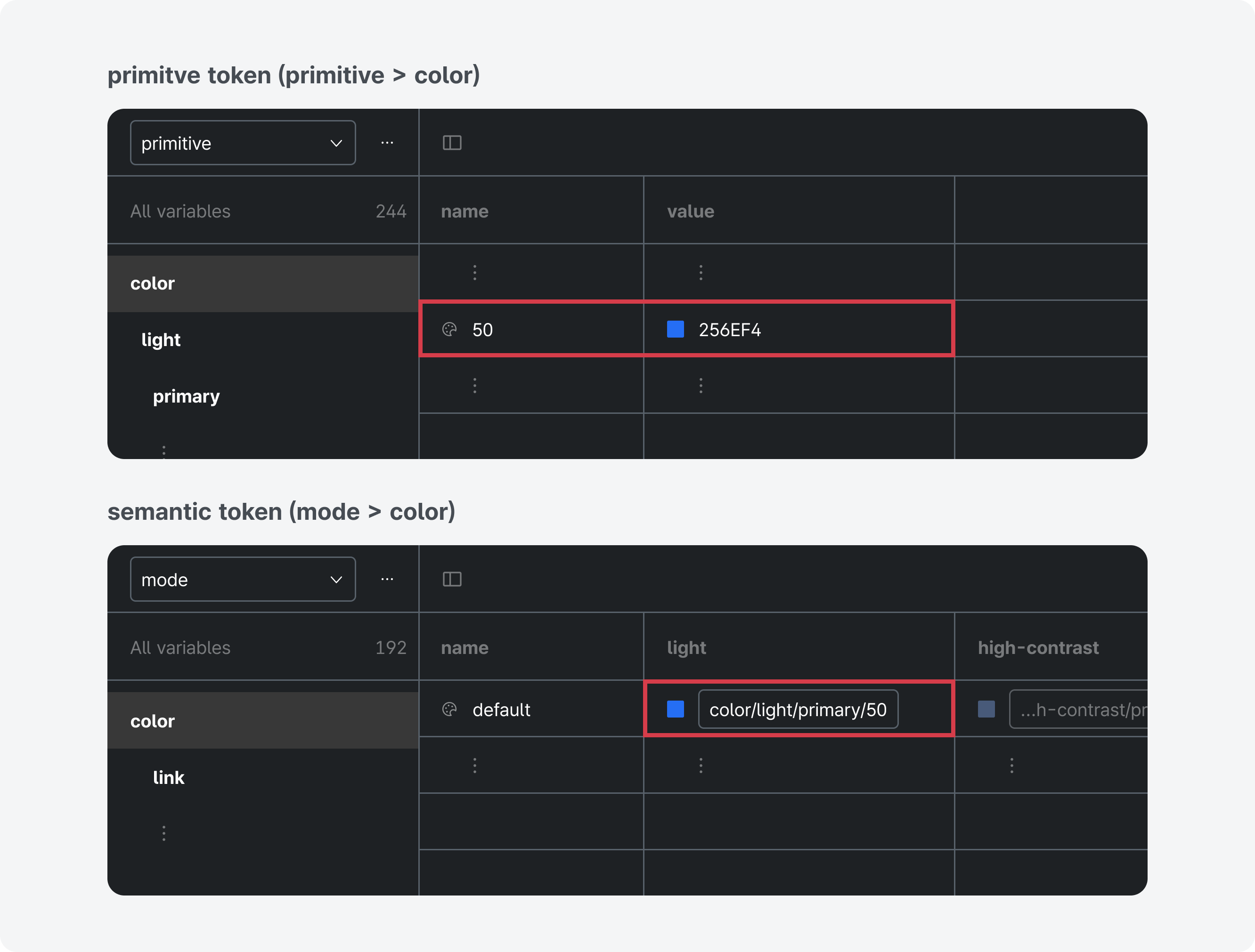
Color Tokens
Color styles in KRDS are managed through both local variables and local styles. Solid colors (#000000) are managed in local variables, while gradient colors are registered as color tokens in regional styles.
Color-related tokens are included in the mode collection as semantic tokens that assign aliases to primitive color values (color variables). The mode collection defines color sets for specific purposes, such as background, text, and icons, and provides them in both light and high-contrast modes. Primitive color variables, such as #000000 or #FFCD29, are registered as solid values and can be found in the primitive tokens. The primitive collection provides two palettes for light mode and high-contrast mode.
Institutions may also create custom color styles using palette-building methods such as the magic number approach.
Typography Tokens
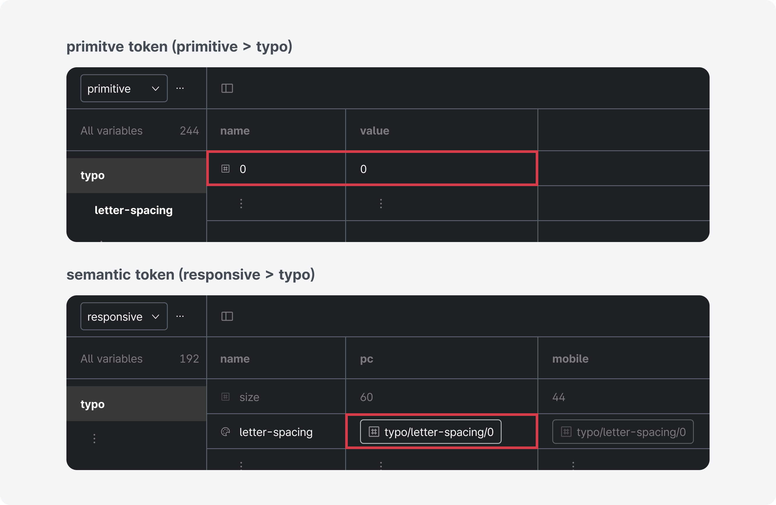
The primitive collection in the local variables stores typeface (string variables), font weight (string variables), and letter spacing (number variables), while the responsive collection contains semantic tokens that combine letter spacing (number variables) and size by hierarchy. The responsive collection contains variables for responsive behavior and provides tokens that support mobile and desktop theme switching.
In KRDS, typography styles are managed through both local variables and local styles. Variables store primitive, reusable values that can represent only one value at a time. Styles store composite sets of multiple values and represent them all at once. Typography consists of composite values, such as typeface, font weight, size, letter spacing, and line height, so it cannot rely solely on local variables. Therefore, KRDS registers each element as a local variable and references it in regional styles.
Line height cannot be defined in px to accommodate different text sizes, so it cannot be registered as a token and must be adjusted within styles when changes are needed.
When creating string variables for typeface families and for style or weight, correct spelling must be used.
(Example: Pretendard GOV, Regular - check the details displayed in the Typography section of the right sidebar)
Shape Tokens
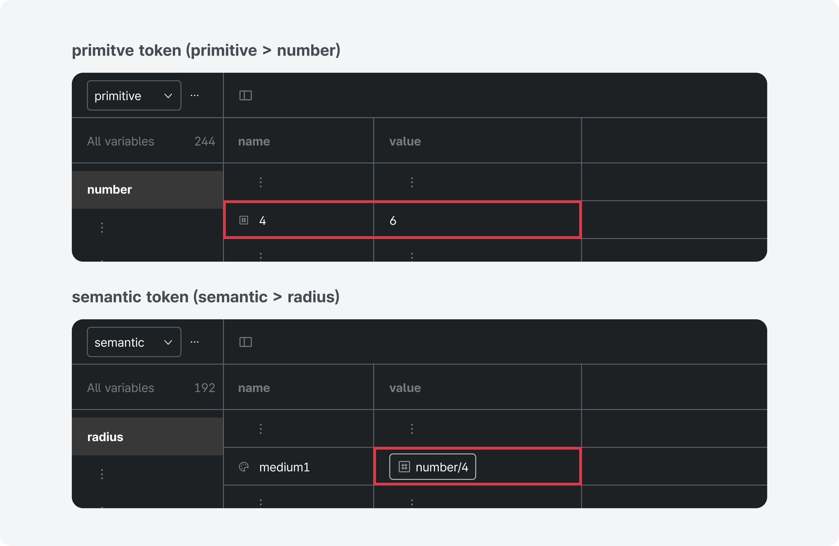
Among the elements that define shape, radius refers to the corner-rounding values applied to UI elements such as buttons, cards, containers, and images.
Radius tokens are implemented by assigning four aliases (small, medium, large, xlarge) to primitive values (number variables) used as primitive tokens. Institutions applying
extended styles may refer to the radius-ratio method to determine appropriate radius values for their systems and then update the numeric variables linked to the semantic tokens.
This helps maintain consistent shapes across components.
Layout Tokens
Layout organizes the information structure and visual flow so that users can clearly understand the content.
Layout-related tokens are found in the responsive collection and include subpage spacing tokens (e.g., header-to-breadcrumb) and text hierarchy spacing tokens (e.g., h2-to-h3).
These are semantic tokens that assign aliases to primitive values (number variables). The number variables use values such as 24 or -8, which are suitable for responsive design.
The responsive collection contains variables for responsive behavior and provides tokens that support mobile and desktop theme switching.

Checking Design with the Guidelines
KRDS provides detailed guidance for inclusive UI and UX design and implementation and offers guidelines to ensure consistency across digital government services.
Style Guide
The Style Guide presents rules and production guidelines for maintaining consistency across design elements, including color, typography, shape, layout, elevation, and icons, helping ensure quality and credibility as an official e-government website.
Accessibility Guide
The Accessibility Guide presents visual guidance based on the W3C Web Content Accessibility Guidelines Level AA or higher to ensure that all users of official e-government websites can access information without difficulty. When institutions modify and use design assets, they must verify that the guideline items listed in the Accessibility section are fully met.